
Tidyverse Portfolio
library(tidyverse)
library(plotly)
library(forcats)
library(reshape2)
library(magrittr)
Spotify: Genre Popularity by Artist
Import the spotify data an drop index column cause it contains redundant information.
spotify <- read_csv("top50.csv", col_names=c(
  "index", "Song", "Artist", "Genre", "BPM", "Energy", "Danceability",
  "Loudness", "Liveness", "Valence", "Length", "Acousticness",
  "Speechiness", "Popularity"),
  col_types=cols(
    index=col_double(),
    Song=col_factor(),
    Artist=col_factor(),
    Genre=col_factor()),
  skip=1)
# Index column contains row_numbers
spotify <- spotify %>% select(-c("index"))
For brevity, will change the name of the genres and change one of the artists cause it has a non utf-8 name.
levels(spotify$Genre) <- c(
  "CanPop", "ReggaeFlow", "DancePop", "Pop", "DfwRap", "Trap", "CountryRap",
  "ElecPop", "Reggaeton", "PanPop", "CanadaHH", "Latin", "EscapeRoom",
  "PopHouse", "AustrPop", "EDM", "AltHH", "BigRoom", "BoyBand", "R&Besp",
  "Brostep"
)
levels(spotify$Artist) <- c(
  "Shawn Mendes", "Anuel AA", "Ariana Grande", "Ed Sheeran", "Post Malone",
  "Lil Tecca", "Sam Smith", "Lil Nas X", "Billie Eilish", "Bad Bunny",
  "DJ Snake", "Lewis Capaldi", "Sech", "Drake", "Chris Brown",
  "J Balvin", "Y2K", "Lizzo", "MEDUZA", "Jhay Cortez","Lunay", "Tones and I",
  "Ali Gatie", "Daddy Yankee", "The Chainsmokers", "Maluma", "Young Thug",
  "Katy Perry", "Martin Garrix", "Jonas Brothers", "Lauv", "Kygo",
  "Taylor Swift", "Lady Gaga", "Khalid","ROSALìA", "Marshmello", "Nicky Jam"
)
Let’s make a bar plot in polar coordinates showing the popularity of genres and stack the columns by artists.
spotify %>%
{ggplot(data=spotify) +
   geom_bar(aes(x=Genre, fill=Artist)) +
   coord_polar() +
   theme(axis.text.x=element_text(size=12)) +
   labs(y="Number of Songs per Genre",
        title="Top 50 Spotify Songs by Genre by Artist") +
   theme(plot.title=element_text(hjust=0.5))}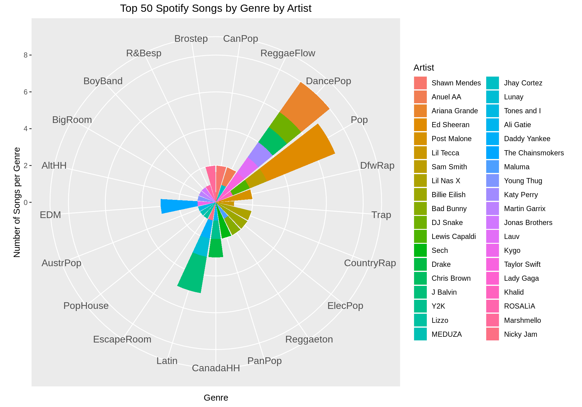
We can also obtain an equivalent interactive version using plotly which makes it easier to understand when there are multiple variables. Notice how “Dance Pop” and “Pop” are the most popular genres in the top 50 Spotify songs, and how Ed Sheeran dominates the “Pop” genre.
# First, create new dataframe where we re-order the factor
spotify_ordered <- within(
  spotify,
  Genre <- factor(Genre, levels=names(sort(table(Genre), decreasing=TRUE)))
  )
#forcats::fct_infreq(Genre)
p <- ggplot(data=spotify_ordered) +
  geom_bar(aes(x=Genre, fill=Artist)) +
  coord_flip() +
  theme(axis.text.x=element_text(size=12)) +
  labs(y="Number of Songs per Genre",
       title="Top 50 Spotify Songs by Genre by Artist", x="Genre") +
  theme(plot.title=element_text(hjust=0.5))
ggplotly(p)
Spotify: Correlation of Musical Features
Let’s see the correlation between the different features that describe a song.
# create function to set to NA all upper triangular part of the matrix
upper_tri_to_na <- function(matrix){
  matrix[upper.tri(matrix)] <- NA
  return(matrix)
}
# Find the melted correlation matrix (should I add/remove BPM?)
melted_corrmatrix <- spotify %>%
  select(-c(Genre, Artist, Song)) %>% cor %>%
  upper_tri_to_na %>%
  melt %>%
  mutate(value=round(value, digits=2))
# Plot correlation plot
ggplot(melted_corrmatrix, aes(x=Var1, y=Var2, fill=value)) +
  geom_tile(color="white") +
  geom_text(aes(x=Var1, y=Var2, label=value), color="grey90", size=10) +
  theme(axis.text.x=element_text(size=15),
        axis.title.x=element_blank(),
        axis.title.y=element_blank(),
        axis.text.y=element_text(size=15),
        plot.title=element_text(hjust=0.5, size=20),
        legend.title=element_text(size=15),
        legend.text=element_text(size=12)) +
  ggtitle("Correlation between Song Features") +
  labs(fill="Correlation") +
  scale_fill_continuous(na.value="grey91")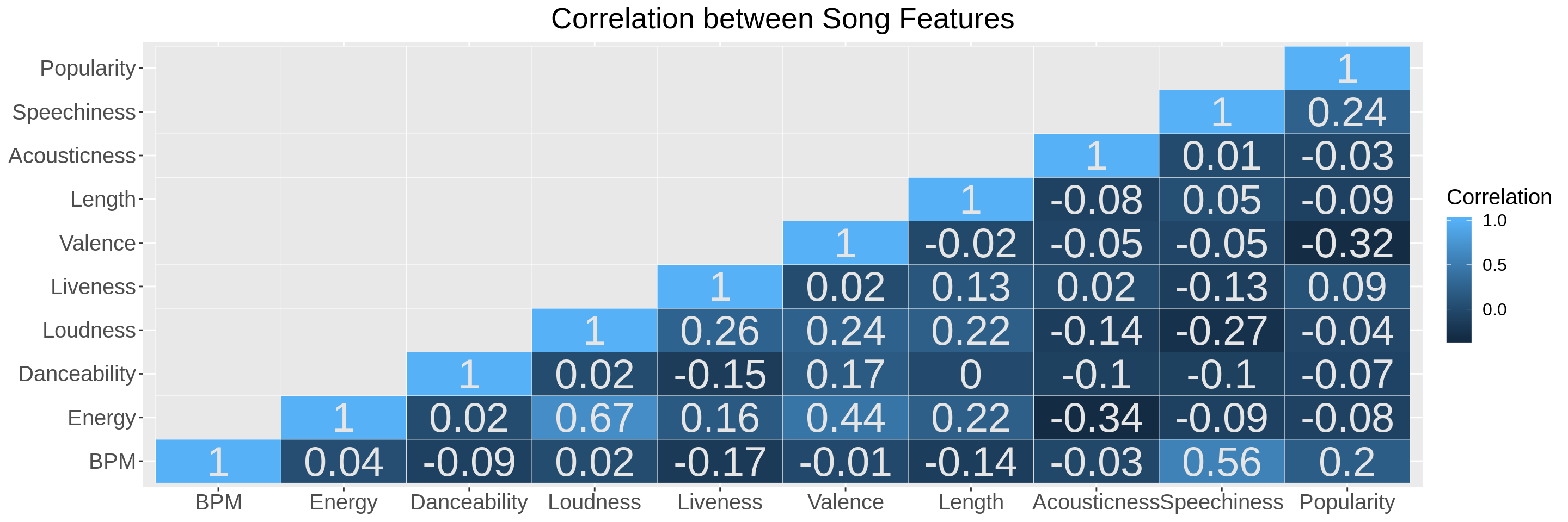
We can see that Loudness and Energy are positively correlated, as one would expect. Surprisingly, Speechiness and BPM are also positively correlated. Energy and Acousticness are negatively correlated instead.
Most Popular Kaggle Kernels
We can also work on the dataset containing information about the most popular kaggle kernels. We cast columns to the correct datatype to avoid problems later on with factors.
# Use `` for column names with spaces
kaggle <- "kagglekernels.csv" %>%
  read_csv(col_types = cols(
      Votes=col_double(),
      Owner=col_factor(),
      Kernel=col_factor(),
      Dataset=col_factor(),
      Output=col_character(),
      `Code Type`=col_factor(),
      Language=col_factor(),
      Comments=col_double(),
      Views=col_double(),
      Forks=col_double())
      )
Want to use kaggle$Output to extract the number of visualizations and the number of data files that each kernel outputs.
kaggle %<>%
  select(Output) %>% # Grab the `Output` column. It contains strings.
  transmute(
    OutputVisualizations = as.numeric(str_extract(Output, "\\d+(?= vis)")),
    OutputFiles = as.numeric(str_extract(Output, "\\d+(?= data fil)"))) %>%
  mutate_all(replace_na, 0) %>% # replace NA with 0s in case nothing is outputted
  cbind(kaggle, .) %>% # bind these columns at the end of kaggle
  select(-Output)  # drop the Output column as it is useless now
We can use this data to see how the number of output visualizations and the number of output files changes as the programming language and the file type change.
kaggle %>%
select(c(Language, OutputVisualizations, OutputFiles, `Code Type`)) %>%
group_by(`Code Type`, Language) %>%
summarise(
Visualizations=sum(OutputVisualizations),
Files=sum(OutputFiles)) %>%
gather("Outputs", "NumOutputs", -Language, -`Code Type`) %>%
ggplot(aes(x=Language, y=NumOutputs, fill=Outputs, color=Outputs)) +
geom_bar(stat="identity", alpha=0.3) +
facet_wrap(~`Code Type`) +
labs(
y="Total Outputs (Visualizations + Files)",
x="Programming Language",
title="Output Visualizations and Files by Language and Code Type")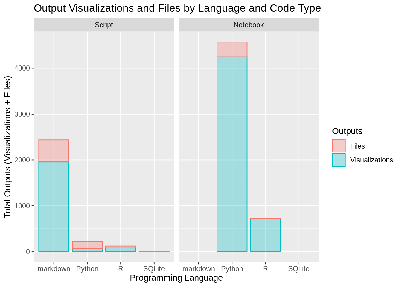 We can see that among the scripts
 markdown outputs many more visualizations that any other programming language. We can also notice how R notebooks seem to mainly output visualizations and not many files, as it would seem reasonable. SQLite also does not suprise, it only outputs files because it is a query language.
Kaggle Kernels: Tags, Programming Languages and File Types
Python seems to be the most utilized languages among the top-voted kernels. Let’s see how this changes if we also group them by code type. Code type has two options Script or Notebook. Notice that we want to group by code type first, and then by language. Not the other way around.
title <- "Programming Language and File Type Popularity in Top-Voted Kaggle Kernels"
kaggle %>%
  group_by(`Code Type`, Language) %>%
  count %>%
  ggplot(aes(x=`Code Type`, y=n, color=Language, fill=Language, label=paste(n))) +
    geom_bar(position="dodge", stat="identity", alpha=0.2) +
    labs(
      x="Submission File Type", y="Number of Kernels",
      title=title) +
    geom_text(size=5, position=position_dodge2(width=0.9),
show.legend = FALSE, vjust=-0.2) 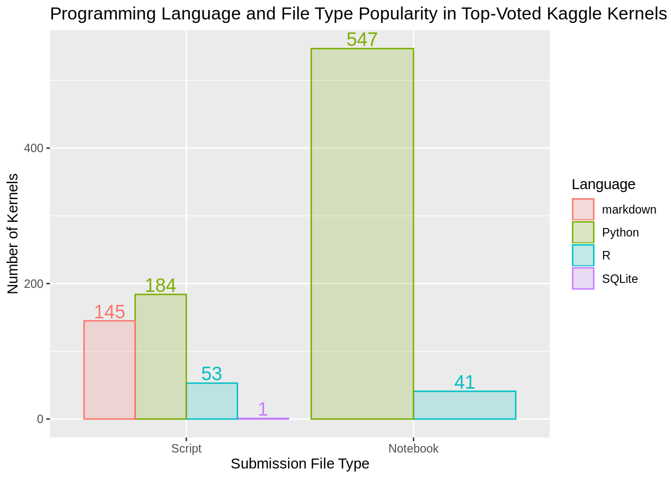
We can also look at the tag frequency in the top-voted kaggle kernels.
# Get a dataframe with a column for every tag. Values in that column
# are 0 or 1s depending if that kernel was tagged with it.
tagcount <- kaggle  %>%
    select(Tags) %>%
    mutate(rn=row_number()) %>%    # Add a col with row indeces
    separate_rows(Tags, sep="\\s*,\\s*") %>%  # RegEx comma-separated tags
    mutate(i1=1) %>%                          # Add column to uniquely identify
    mutate_all(~na_if(., "")) %>%     # remove NA values generated by "<tag>,"
    pivot_wider(names_from = Tags,
                values_from = i1,
                values_fill = list(i1 = 0)) %>% # Wide format
    select(-rn) %>% # remove row index
  colSums %>%       # sum up the tag count
  t
# Notice that NA values during `pivot_wider` will be cast to strings in order
# to become column names. We therefore need to get rid of it. Get a flat saying
# which elements of the named vector `tagcount` are not "NA".
flag <- dimnames(tagcount)[[2]] != "NA"
# Use flat to get tags, values and the correct ordering
tags <- dimnames(tagcount)[[2]][flag]
tagcount <- tagcount[flag]
order_ind <- tagcount %>% order(decreasing=TRUE)
# now order both the tagcount and the names
tagcount <- tagcount[order_ind]
tags <- tags[order_ind]
# finally put everything together into a tibble
tagcountdf <- tibble(tag=as.factor(tags), count=as.double(tagcount))
# let's consider tags used 5 times or more
tagcountdf %>%
  subset(count>=5) %>%
  {ggplot(data=., aes(x=tag, y=count)) +
    geom_bar(stat="identity", color="white", width=1.0) +
    coord_flip() +
    theme(axis.text.x=element_text(size=9),
          axis.title.x=element_text(size=15),
          axis.text.y=element_text(size=9),
          axis.title.y=element_text(size=15)) +
    labs(x="Tags Used More then 5 times",
         title="Most Popular Tags in Top-Voted Kaggle Kernels",
         y="Number of Occurrencies") +
    scale_y_continuous(expand=c(0,0), limits = c(0, max(tagcount)+0.1)) +
    scale_x_discrete(limits=.$tag)} %>%
  ggplotly